During our initial usability testing for our site navigation design, both before we started that project and after we released the new design, users also indicated that there was a major issue with the Client Record detail section of the CRM. We consistently received feedback that it took “too many clicks” to get to the information they wanted, and that they often lost their place while working with information in one of the subsections. The problem with feedback of “too many clicks” is – what does that really mean when you have thirty subsections for the Client Record and each of those subsection were also data packed? It was decided to conduct additional user testing of just the client record.
Research Methods:
- We arranged follow up interviews with users who had complained about how awkward and time consuming it was to get to the information they wanted on the client record.
- We created a scripted task for users to execute within the client record and then recorded them doing it via a GTM to see what their workflow was and how long it took.
- We consulted with SMEs and our trainers about their experience training people on the client record section and what pain points they consistently observed.
- Lastly, we held several rounds via moderated usability testing and focus groups.
Research Findings:
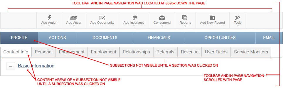
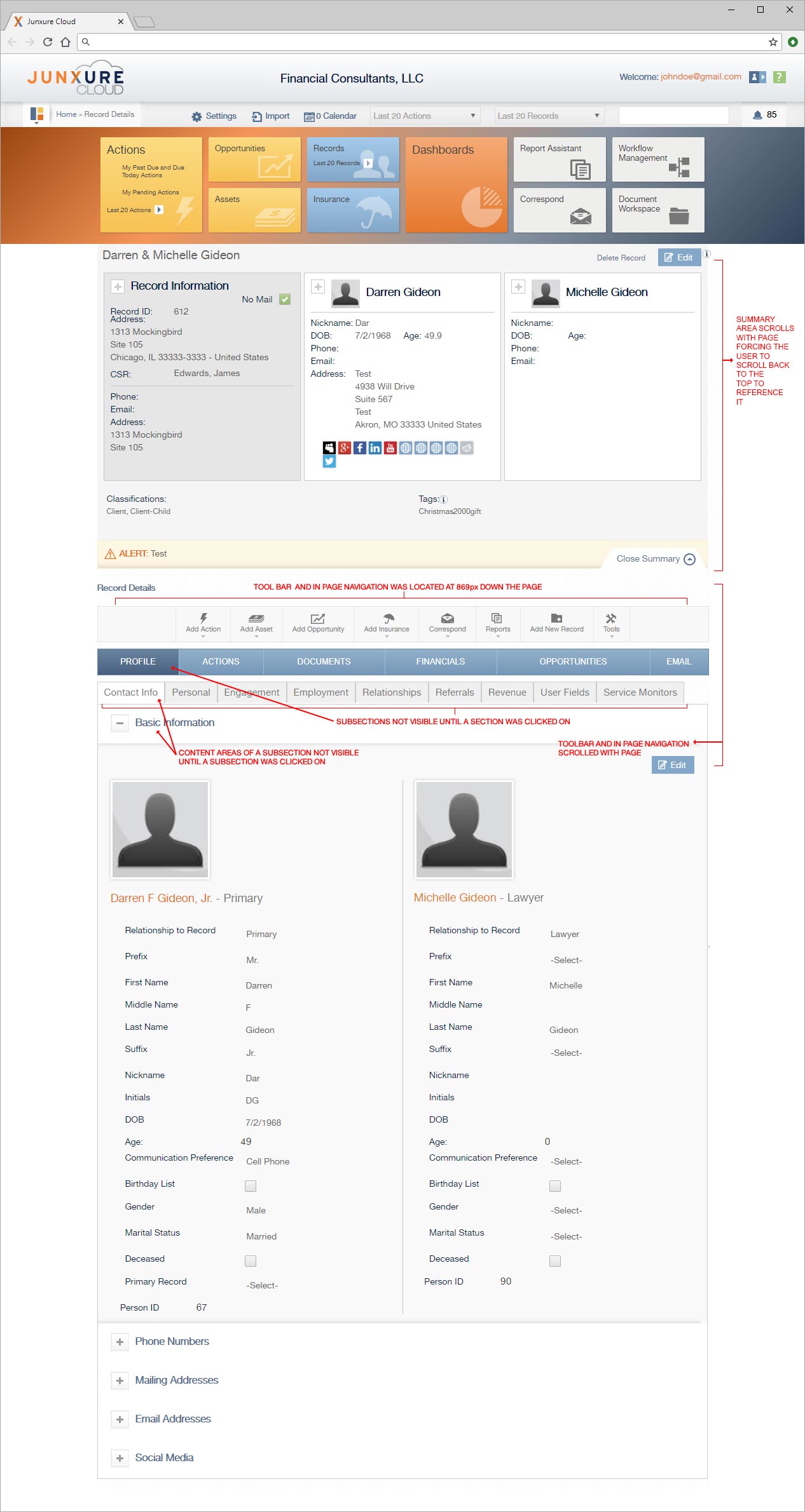
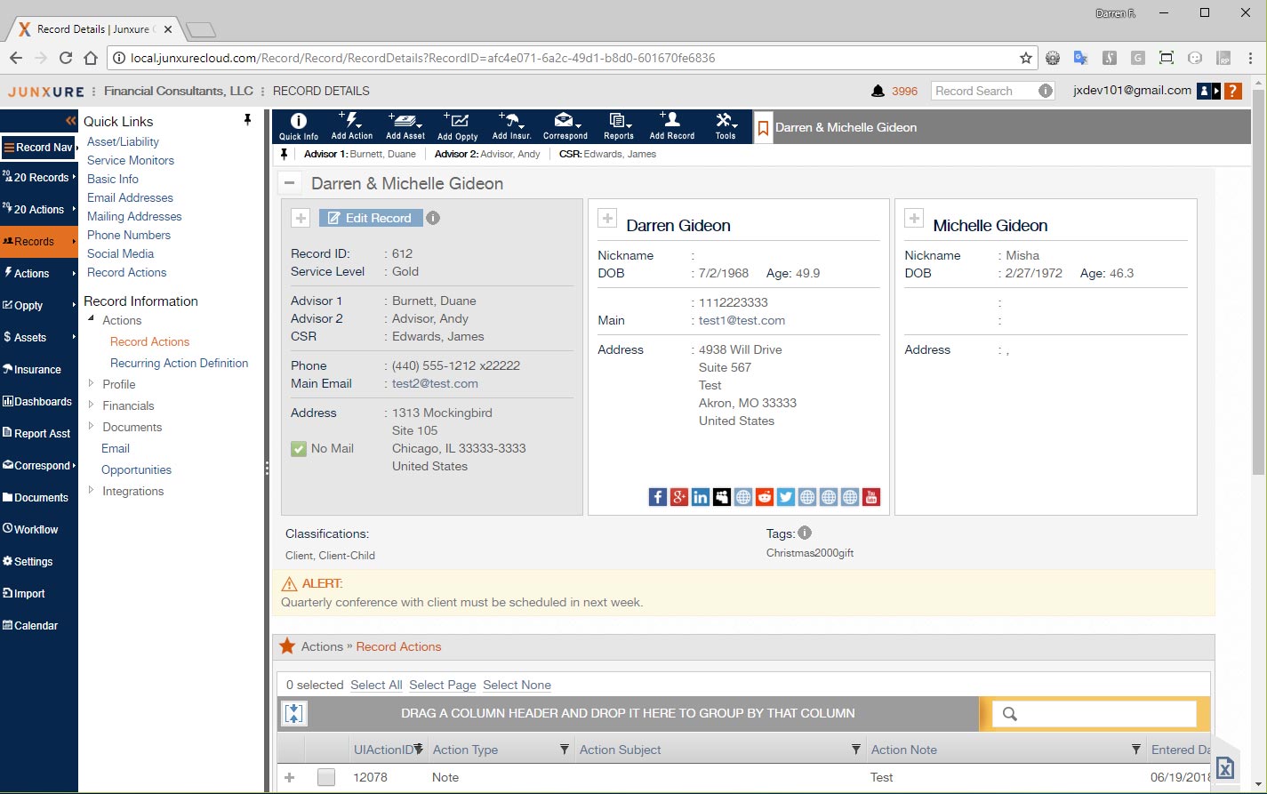
- The default setting for the section summary area of the page was to be open / expanded and our analytics showed that most people never changed it from this which resulted in a user having to scroll down 869 pixels before they saw and were enable to interact with the record toolbar client record section navigation.
- There was no quick way to access any of the subsection areas and the specific panels of one of those areas. The user was forced to click on a Section tab (Profile, Actions, Documents, Financials, Opportunities, or Email) to see what subsections existed. They then had to click on that subsection to see the panel info areas for it and then click to toggle the panel’s expanded or collapsed status. The process had to be repeated to go to a different section of the page.
- The record toolbar and section navigation was not fixed; it scrolled with the page. This resulted in the user having to scroll down to read content and then scroll back up to interact with the record toolbar or to view another section of the client record.
- The summary area of the client record was not fixed. If the user needed to consult it they had to scroll back to the top of the page and then scroll back to what section they were previously viewing – oftentimes losing their place.
- While the users’ summed things up as it was taking too many clicks to access information, what we observed and confirmed was more a case of too much effort was needed to find and access information; there was a lot of scrolling up and down the page constantly and then unnecessary clicks to just show what options were available.
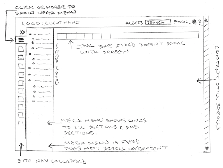
At the conclusion of our user research we concluded that the use of a mega menu and fixed the record toolbar and record section navigation in place so that it didn’t scroll would resolve many of the issues. I quickly sketched out a concept to get the product owner, SMEs, and developers initial thoughts on that possible direction.
Once all involved parties agreed upon exploring the mega menu, fixed toolbar, at fixed record section navigation, I moved on to start prototyping the new functionality in Axure. This allowed me to present and demonstrate the new functionality to our SMEs and user focus groups to see if the solution worked or needed additional refinement or completely different functionality. Through this iterative process, we discovered that the mega menu was not the perfect option since it was still cumbersome when doing data entry to hover or click to bring it up to go to a different section. So, we needed more of a pinnable panel where the user could choose to keep it in place until they decided to collapse it later. A tree navigation pattern for the section links turned out to be more efficient, allowing a user to open the nodes they were interested in instead of dealing with everything being open or a hierarchical menu structure.
Also during this iterative process, we found the users constantly referenced the summary area for basic information they needed while using other sections. A mechanism was prototyped to allow them to show the summary and hide without having to scroll to the top of the page.
Lastly, the concept of letting the user create in page bookmark links, which we referred to as quick links, was prototyped. This allowed a user to create a quick link to a section they used constantly allowing them to skip the need to interact with the in page record tree navigation.

Improvements
- Record toolbar was fixed to the top of the page and no longer scrolled with page content
- When site navigation was expanded, the record tool bar buttons were also expanded to show icons and text
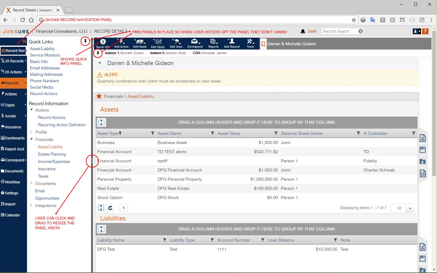
- A new info button was created that showed a slim panel under the record toolbar, with just key quick info for the user so that they didn’t not have to show the full record summary (which covered valuable screen real estate).
- The quick info panel was made pinnable by the user
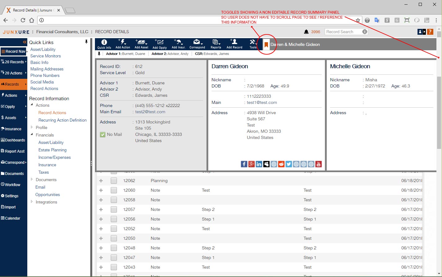
- A bookmark icon was added to the record toolbar which would toggle the display of the record summary in a fixed float panel, alleviating the need for the user to scroll back to the top of the page to access the summary.
- The record in page navigation was moved to a left side panel that the user could display by hover / click / tap from a button added to the left side site navigation.
- The record in page was made pinnable so that the user could always keep it open and the state of it being pinned or not pinned was remembered.
- The user was given the ability to resize the width of the navigation panel with their mouse which also resized the content area
- The in page navigation panel did not scroll with the page, so the user always had access to it without having to scroll up
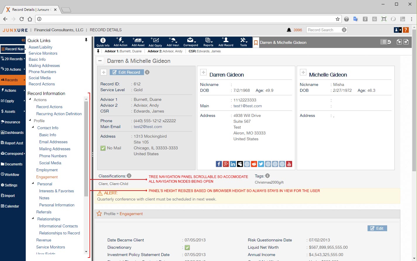
- A tree node navigation pattern was used for displaying the up to thirty sections of the client record. This allowed for the user to just open the nodes they wanted to get to the information they needed.
- The state of the open and close nodes of the navigation tree was remembered from record to record, so if the user was updating a specific section for multiple records they did not have to spend time navigating back to the section they were on.
- When the user came back to a record, the last section they were in was automatically opened for them.
- A Quick Link system (in page bookmarks) was created where the user could create up to ten quick links to specific sections of the client record. Clicking on a quick link automatically opened that section in screen and opened the appropriate nodes in the tree navigation. For sections that were constantly used, this removed the need to use the tree navigation of opening nodes to get to the desired section.
Implementation
When the final protote was approved, I then created hi def deliverables, which applied the Junxure current style guide, and for those elements that already did not have a pattern / style, created one for them and documented it. Along with the developers and QA, I worked to make sure everything was implemented as designed. In addition, in my role as a UI Developer, I assisted with the implementation by writing HTML, CSS, and Javascript / jQuery code for the new functionality.
Success Criteria
We defined what we would consider the success criteria for the project and then created a follow up plan on how to test this criteria. This was done by putting analytics in place to measure the use of the new pinnable record in page navigation panel, the pinnable quick info panel, the toggle of the record summary, and the use of quick links. User interviews, focus groups sessions, and moderated usability testing were also conducted to measure if the user experience was improved and if the productivity issues were successfully addressed.