Junxure initially was a desktop CRM application for financial advisors. The CRM was extremely data rich, encompassing detailed information about the client and a host of other CRM functions for the financial advisor. When a cloud version was created, it was decided to focus just on the desktop and tablet experience because of the depth and complexity of the information that a financial advisor needed.
However, the company’s feedback mechanisms were inundated with requests from users and sales / marketing department for a mobile version. The problem with these requests was that there was no definition of what was meant by a “mobile version” outside of it being used on the phone. We needed to conduct user research to determine what information and functionality was actually desired.
Research Methods:
- We interviewed our product trainers and other SMEs to determine what features and information was actually needed.
- We also interviewed specific users who had provided the feedback to gather more insights on what they needed in a mobile experience.
Research Findings:
- Most of the functionality of Junxure was not desired on a mobile phone.
- Users wanted to be able to quickly look up a client’s contact and other key information. This was because there were business and travel situations where they only had easy access to their mobile phone.
- They did not want the ability to edit a client’s information since that required a significant amount of data entry.
- Ability to access actions they were supposed to do for clients consisting of read only information; no edit capability was desired.
- Finally they wanted access to the alert system so they could be notified of items assigned to them and status updates.
After the product owners agreed upon the design recommendations and all of the technical requirements were set, I moved directly into prototyping the proposed functionality in Axure. Prototyping allowed me to present desired functionality to our developers so that they could give time estimations for the scope of work and inform our QA team of what they would be testing. We also had a very compressed time frame for the development and release, so I had to do fast iterative prototyping where I was only able to demo the prototype to the Product Owners, SMEs, and developers; get their feedback, and then revise the axure prototypes with them present.
Adaptive Functionality
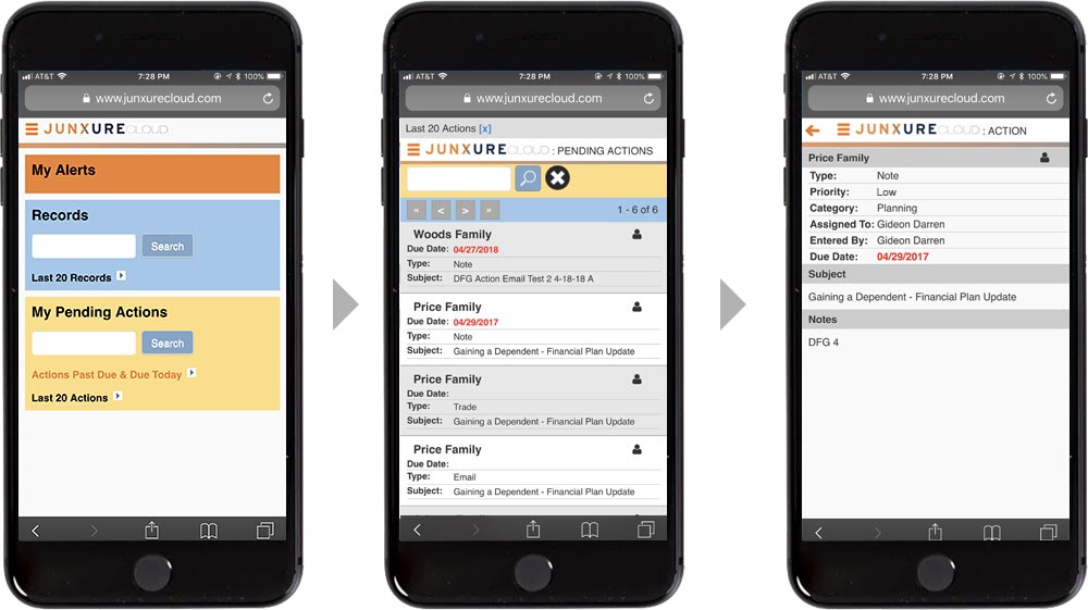
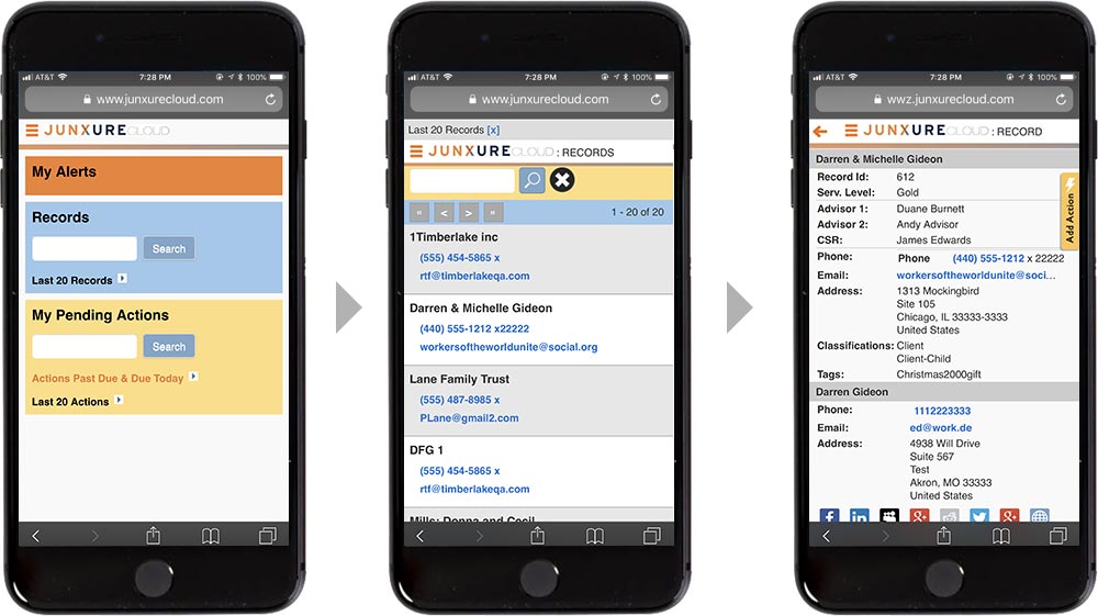
- After logging in, the mobile user was presented with a simplified home page with links to Alerts, Records, and Actions.
- User was able to search records and provide a link to the last 20 records
- User was able to search actions, provide a link to last 20 actions, and actions that were past due or due today
- The record workspace screen provided a list of records with just the record name, a phone number link, and an email link
- The user could tap on the record to get more in depth key information
- The action workspace screen provided a list of actions with just the action name, due date, action type, and subject
- The user could tap on the action to get more in depth key information and notes
Implementation
After functionality was agreed upon from prototyping, I created hi def deliverables establishing the style guide for our mobile experience. The mobile views were done with Angular and .NET, and I assisted the developers by creating the HTML for them, CSS, and cutting up graphics for the various views.
Success Criteria
After the mobile experience was released, we conducted user interviews, focus group sessions, and moderated usability testing to judge whether we were successful in creating an experience that delivered just the key information that users needed on their phones. During this follow up testing, it was discovered that users did want to be able to create very simple actions on their phones; basically the ability to create a note for a client record. This additional functionality was then added in the following release.
Action Workflow
Record Workflow


