From several of the website’s feedback mechanisms, we received responses from our users indicating they found the main navigation awkward and that it negatively affected their productivity. It was decided to investigate the validity of this via several methods.
Research Methods:
- First, we collated the actual feedback sent to establish there indeed was a pattern and to see how persuasive the feedback on this subject was.
- Next, we interviewed our customer support techs and product trainers to see how often this came up during their verbal interactions with clients.
- We then setup interviews with specific users who had provided the feedback to gather more in-depth insights about their experience.
- Finally, we conducted testing on specific scenarios with clients who had not provided direct feedback on this matter via moderated usability testing and focus groups.
Research Findings:
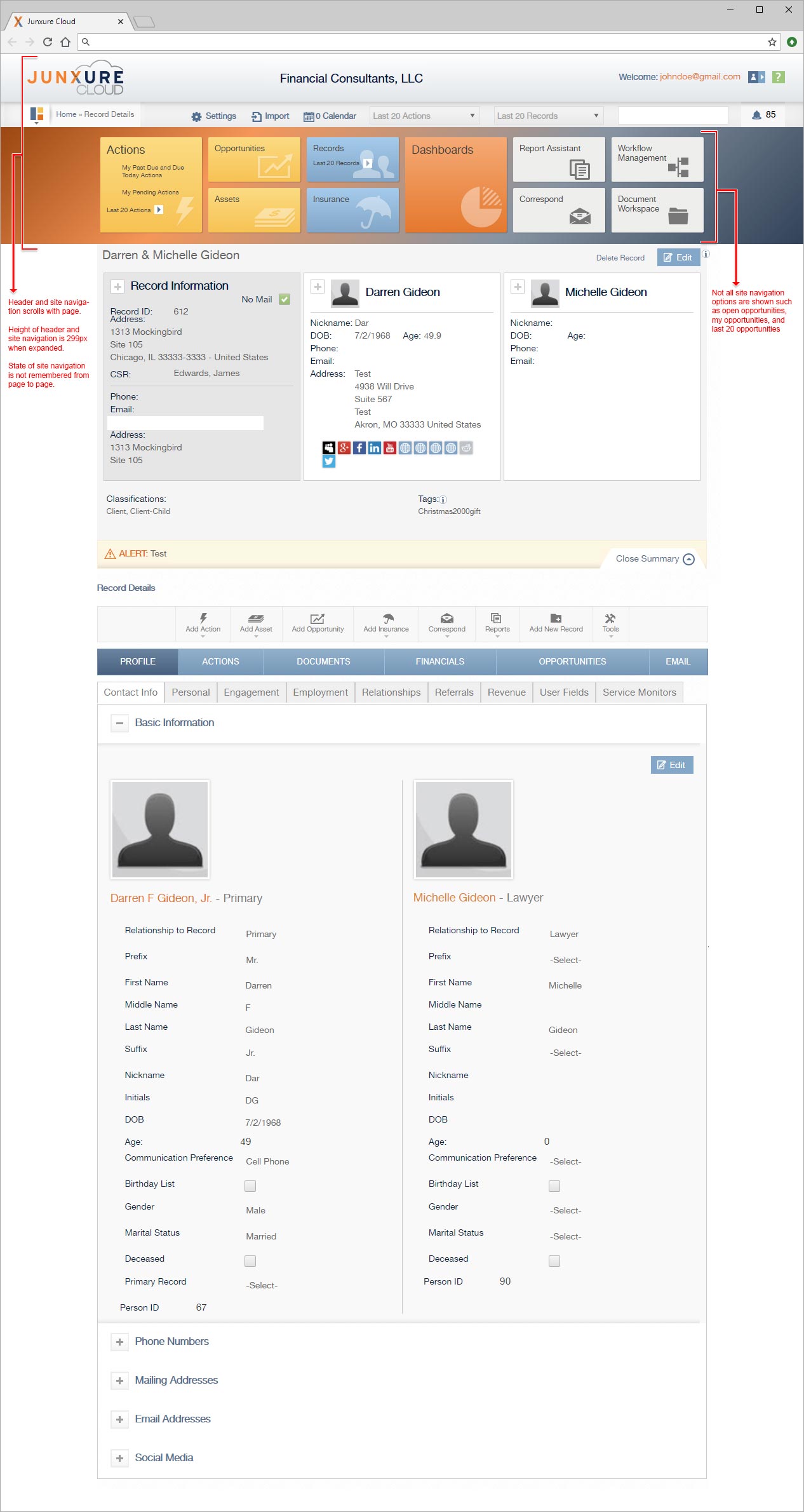
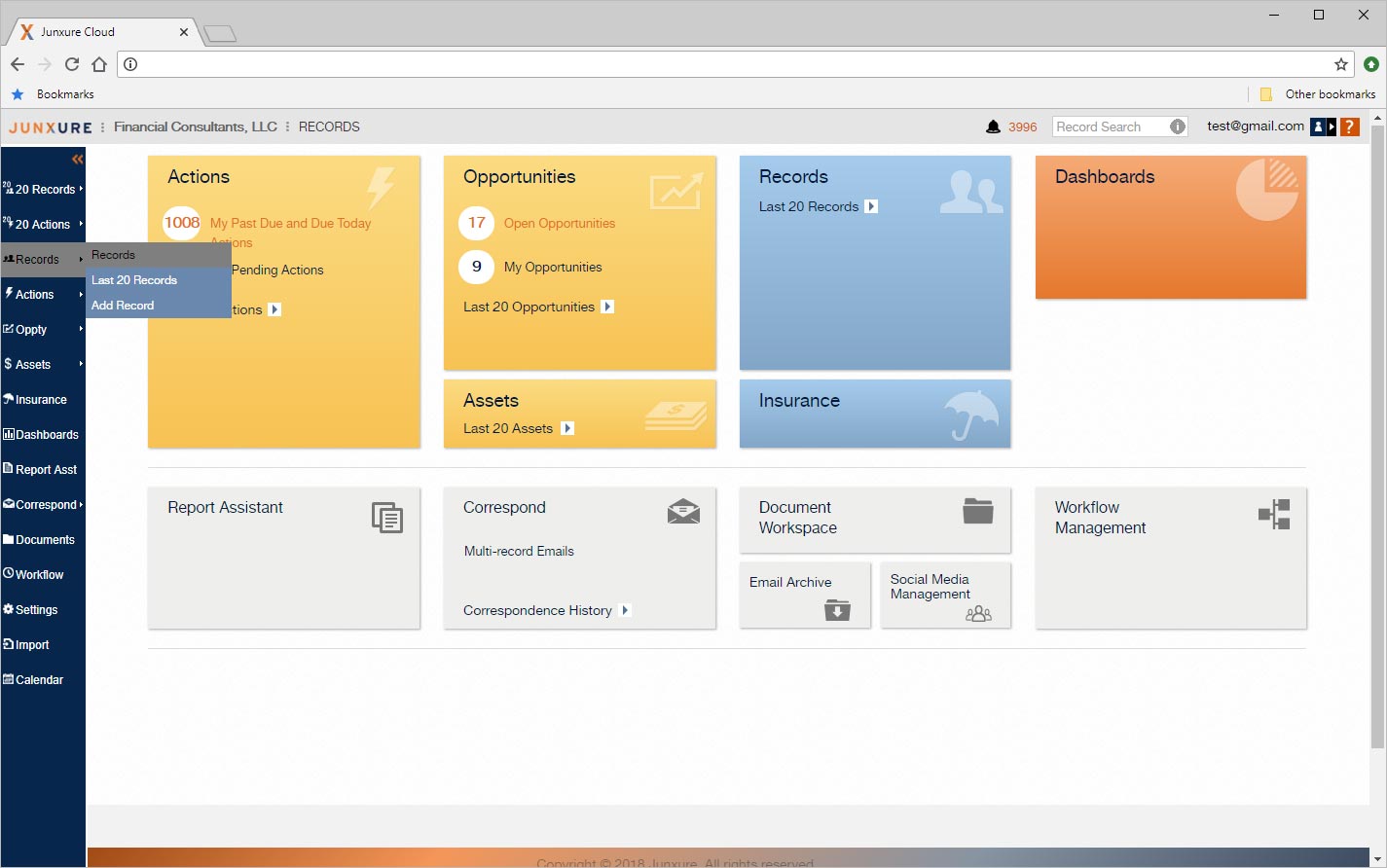
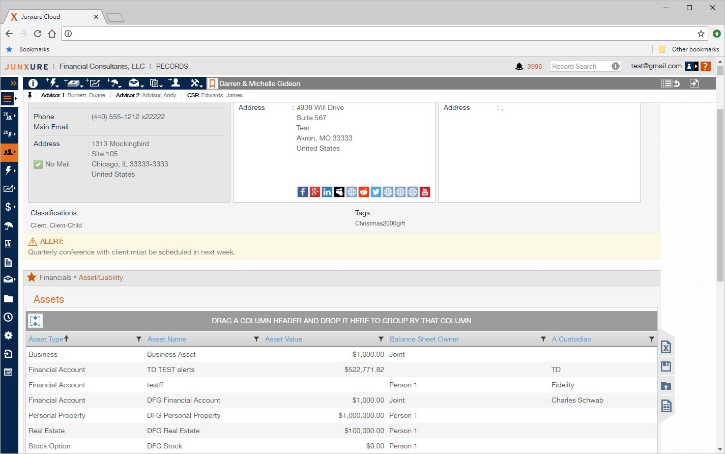
- The header and site navigation were not fixed elements, but scrolled with the content of the screen. While not an issue on our home page, it was an issue for most of the web pages which were data rich – requiring scrolling by the user. Users were being forced to scroll extensively to reach the data they wanted and then to scroll back to the top of the
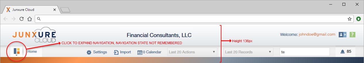
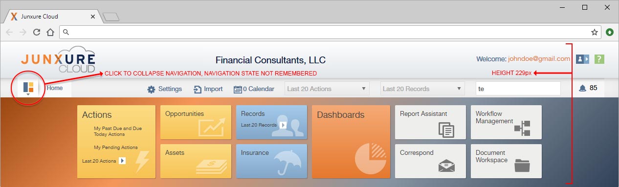
screen to be able to navigate to another area or the application. - A mobile pattern was inappropriately applied to the desktop experience by the Design Agency who had created the UI for us. The site navigation was hidden by default forcing users to click a button to be able to see it. Research showed that desktop users found this to be inefficient and irritating when they were using laptops and desktops, which was 97.1% of the time according
to our analytics. - Once the user had actually clicked to display the site navigation, the status of it being expanded or collapsed was not remembered. If you left the page to go another area of the site or needed to refresh the current page the navigation was hidden again.
- The height of the header area and expanded site navigation took up a significant amount of screen real estate at 229 pixels when expanded and 139 pixels when collapsed. Users who had a monitor resolution of 1920 x 1080 lost 28% of their screen to the header and navigation. While users with a resolution of only 1366×768 lost 39% of their screen. Outside of negative comments about this use of space, we also discovered overall that users wanted a reduction of elements on the page to maximize screen real estate for content and data that they needed as financial advisors.

After all of the technical requirements were gathered and user research was complete, I quickly moved into the sketching stage to get ideas down so that I could start the whole process of presenting ideas to our SMEs, DEVs, and Product Owners; getting their feedback, and then revising the sketch before presenting again. I tried to do this initial stage on either a white board or just paper to quickly focus in on some ideas, discard things that are not working, and refine those that have merit.
First Sketch
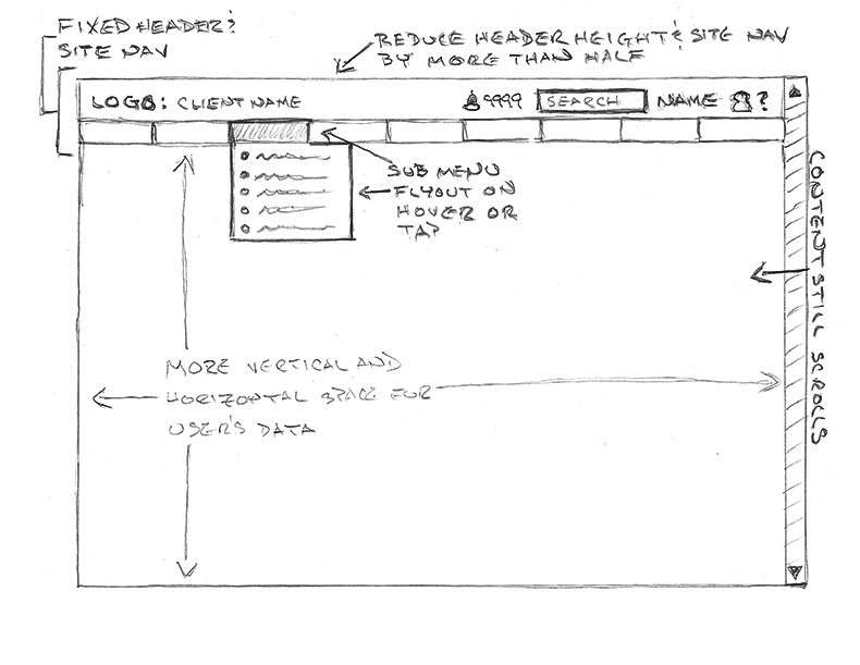
The first sketch was very conservative and based on what the developers could do in one sprint’s worth of time. Basically, it changed the header and navigation into a fixed element that did not scroll with the page or reduce the overall screen height, and used the pattern of a typical top navigation bar with hierarchical sub menus.
Last Sketch
I quickly iterated from my initial sketch through several others when the requirements were revised to allow for more development time and a later release. Based on SME feedback, eventually we arrived at wanting a more desktop application feel along the lines of Photoshop where screen real estate was maximized for content. The header was fixed in place and its height was minimized to just what was needed, since these pages did not need a significant marketing / branding element. Site navigation was moved to the left side of the screen and fixed in place. Analytics showed that most of the financial advisers using Junxure had their monitors in the horizontal position and you could give up some horizontal space to gain more vertical space for content. For the site navigation bar we then provided basic user experience where the navigation showed both icons and text for each item. In addition, we created what we termed “a power user experience” where they could reduce to just icons and tool tips, allowing the individual user to maximize screen space for content if they wished.
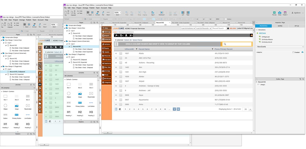
Once the SMEs and Product Owners agreed upon a direction from the pencil sketches, I moved on to start prototyping the new functionality in Axure. Mocking up the functionality allowed me to present it and demonstrate the functionality to the SMEs and user focus groups to get additional feedback for further refinement. An iteration process of present, receive feedback, and revise made sure to keep us on the right track in most areas and found areas to improve on. In addition, it allowed the developers to start seeing what was proposed as actual working desired functionality so they could give better time estimations for what it would take to implement.
Improvements
- Header was fixed in place and no longer scrolled with content.
- Header height was changed from 299px (when old site nav expanded) to 36px.
- Site navigation was moved to the left and fixed in place.
- User could toggle the site navigation from icons and text (88px wide) to just icons (36px wide).
- The state of the site navigation was remembered for the user during a session and the next time they logged in.
- Available space for financial information content was increased for users.
Implementation
After prototyping, the next step of my process consisted of several things. Creating hi def deliverables, which applied the Junxure current style guide, and for those elements that already did not have a pattern / style, creating one for them and documenting it. I worked hand in hand with the developers and QA to make sure everything was implemented as designed. In addition, in my role as a UI Developer, I actually assisted with the implementation by writing HTML, CSS, and Javascript / jQuery code.
Success Criteria
Lastly, I helped to define the success criteria for the project. Before we switched to the new navigation, there was a general feeling that we had power users and normal users and no hard data to back this up. So, I helped to define methods to validate this with site analytics, where we discovered 95.7% of our users never changed the default setting of the navigation state, 3.2% changed it to icons only, and 1.2% toggled back and forth multiple times during a set period. In addition to this, we conducted user interviews, focus groups sessions, and moderated usability testing to validate whether the revisions improved user productivity or not.